
Project // Kuro
Project Type: Logo Design
Overview: Kuro Cabins offers modern, minimalist holiday cabins designed that blend with Cornwall’s lush natural environment.
In collaboration with Koden Digital
"We need a logo that’s minimalist, calm, and tied to nature, capturing our Japandi-style cabins for signage, digital, and promo materials.”
Descriptive keywords: minimalist, japandi, natural
Conceptual & Visual Development
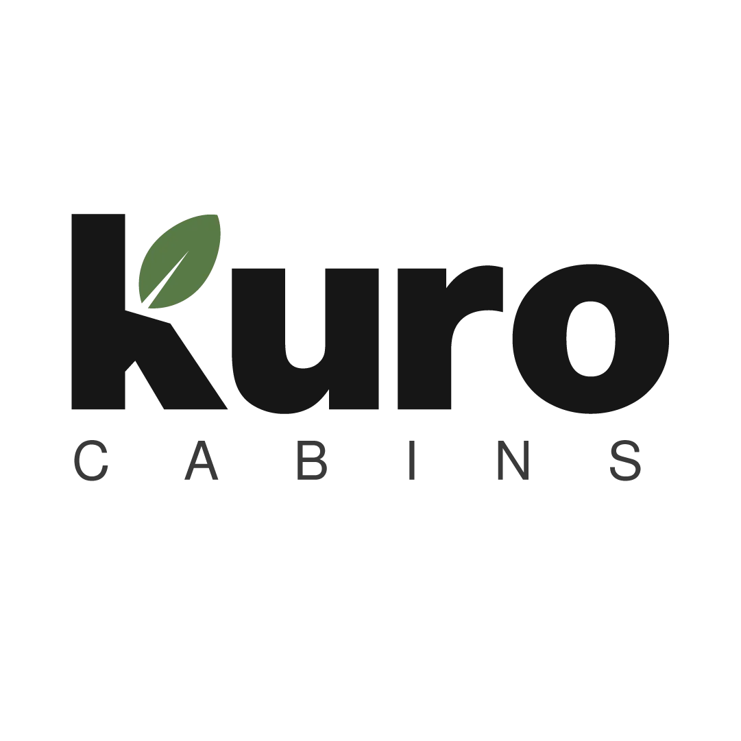
Route 01 //
The first route implemented a black geometric word mark with the addition of a fresh leaf growing from the 'K' signifying its location; tucked away in amongst lush vegetation. Because the word-mark is in lowercase, it communicates calmly and retains the feel of being homely and welcoming.
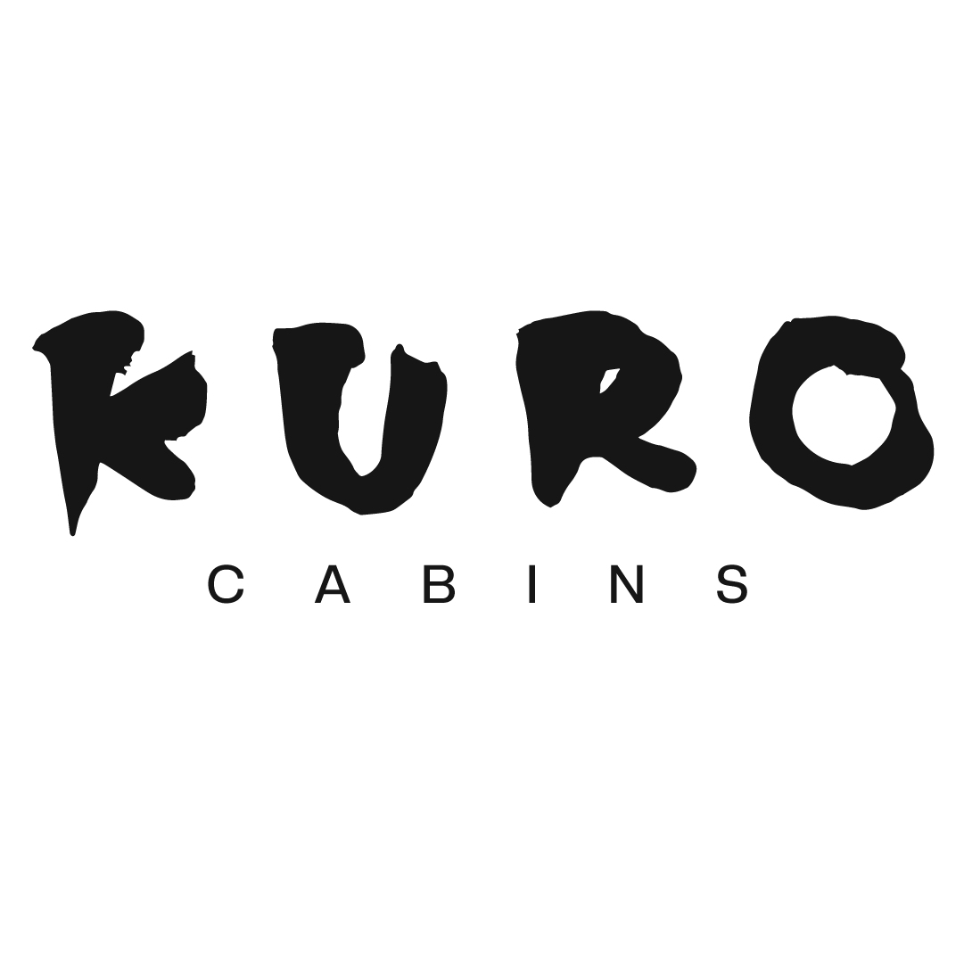
Route 02 //
This second mark leans into Japanese influence, the mark was hand rendered using a traditional Japanese calligraphy brush. This gives it an traditional and expressive feel, allowing it to compliment the shapes of the cabin; being built of natural materials.
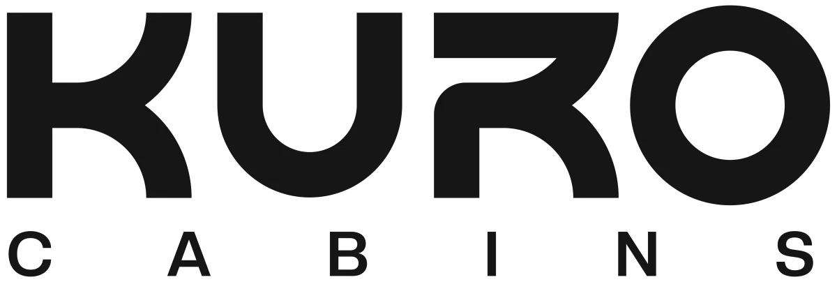
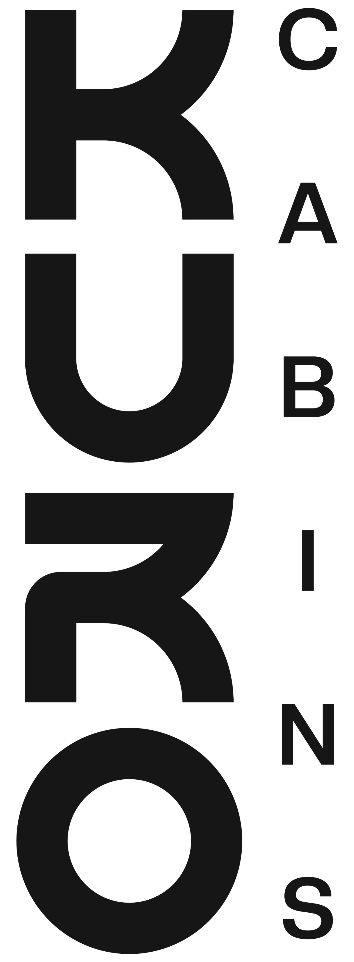
Design Solution
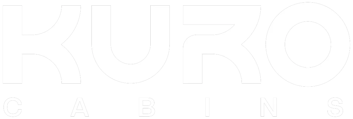
The wordmark's black and earthy tones draw from the name Kuro; the Japanese word for “black”, creating a tranquil yet modern presence.
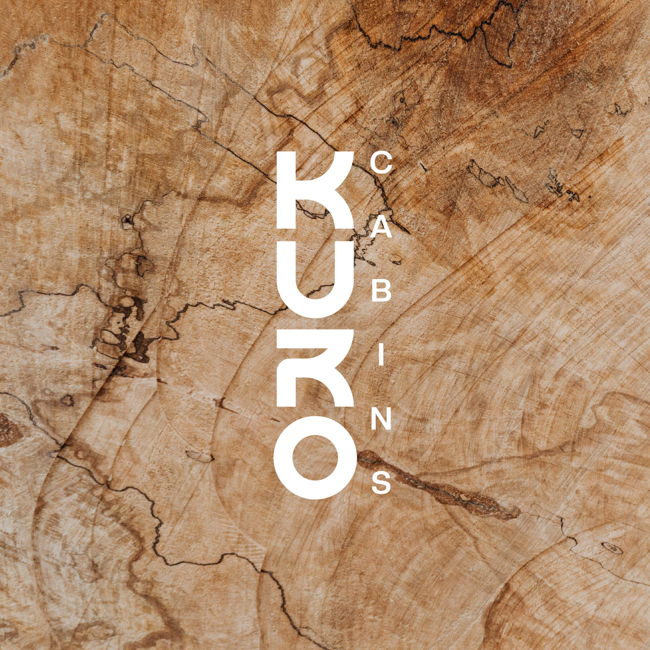
This logotype takes inspiration from Japanese letterforms and Japandi interior design, resulting in an elegant geometric mark that works both horizontally and vertically.
"Working with Will on the Kuro Cabins brand was a great experience. He was quick, professional, efficient, and really listened to our ideas throughout the process. He helped shape the brand into something that genuinely reflects our vision, and we’re really happy with the final result. Highly recommend working with him."
Victoria // Kuro Cabins
▼
Start Your Project
Got a project to start? Click Get Started below.
Terms & Conditions
WillMWCreative Design Manfesto
Frequently Asked Questions