
Project // Mora
Project Type: Multi-Brand Identity
Overview: Mora is a growing creative brand expanding into film production, media services, and podcasting. The project aimed to design a modern, versatile logo system that encapsulates the core Mora brand while providing a cohesive identity for its sub-brands.


"I like quiet neutral tones, simple, minimalist, and use colour sparingly. I’d like them all to feel like they’re from the same brand. The sea has always been a central point of my life. I want to support the local creative community and shine a light on the UK surf scene."
Descriptive keywords: modern, professional, static
Conceptual & Visual Development
Route 01 //
As a project requirement, the logo should work as an aperture through which photography and video can be viewed, enforcing the brand identity further. This route saw the addition of more complex iconography that conformed to the grid, enabling the requested 'aperture' to be within the sub brand ident.
Route 02 //
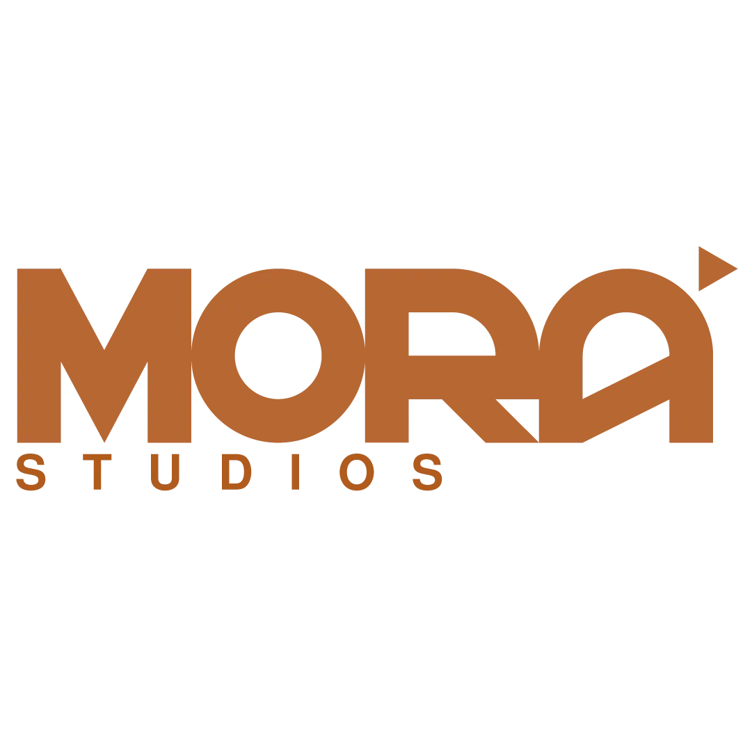
To allow for a consistent aperture, I designed a word mark that tightly conforms to a grid, so that elements can be modular. This mark was the first iteration of the logo using reductive iconography in order to differentiate between the sub-brands.
Design Solution
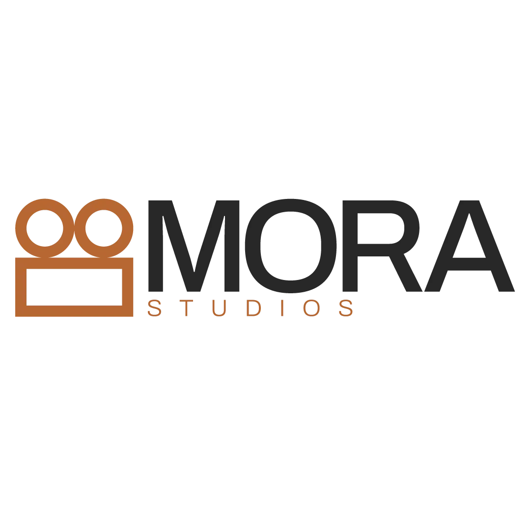
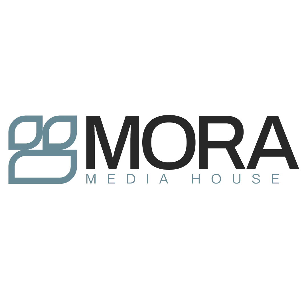
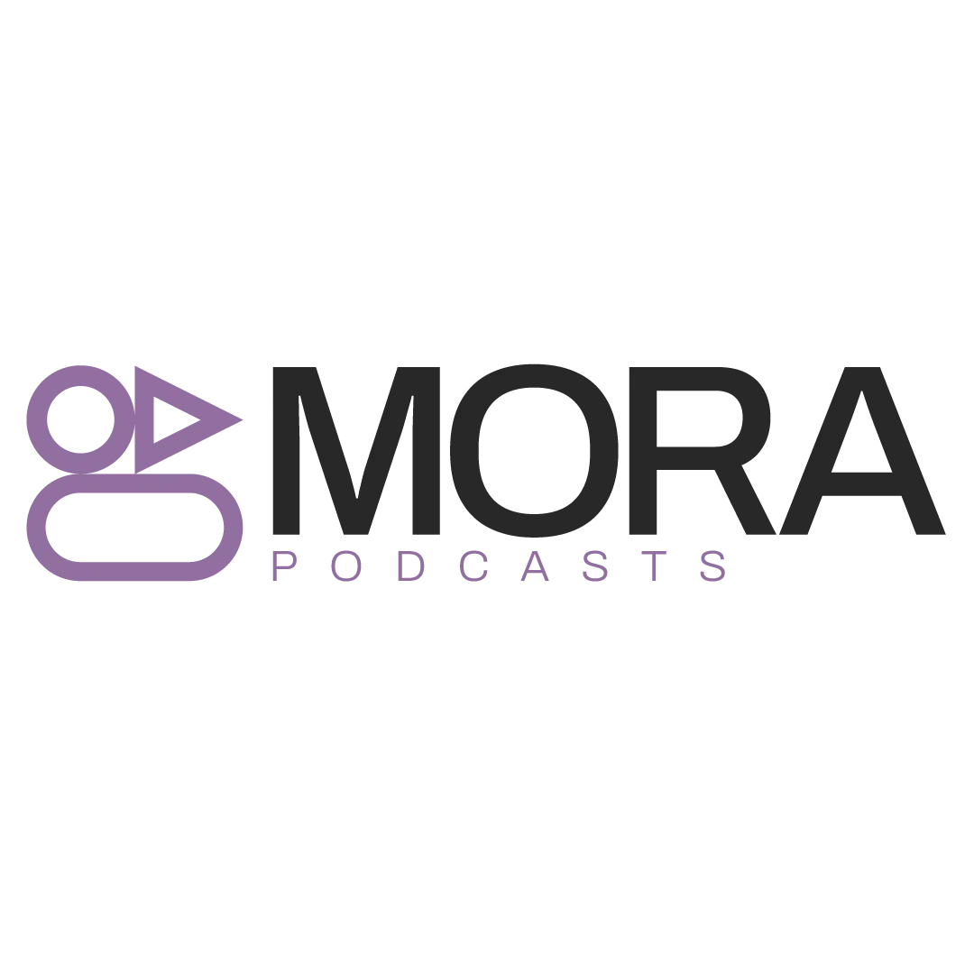
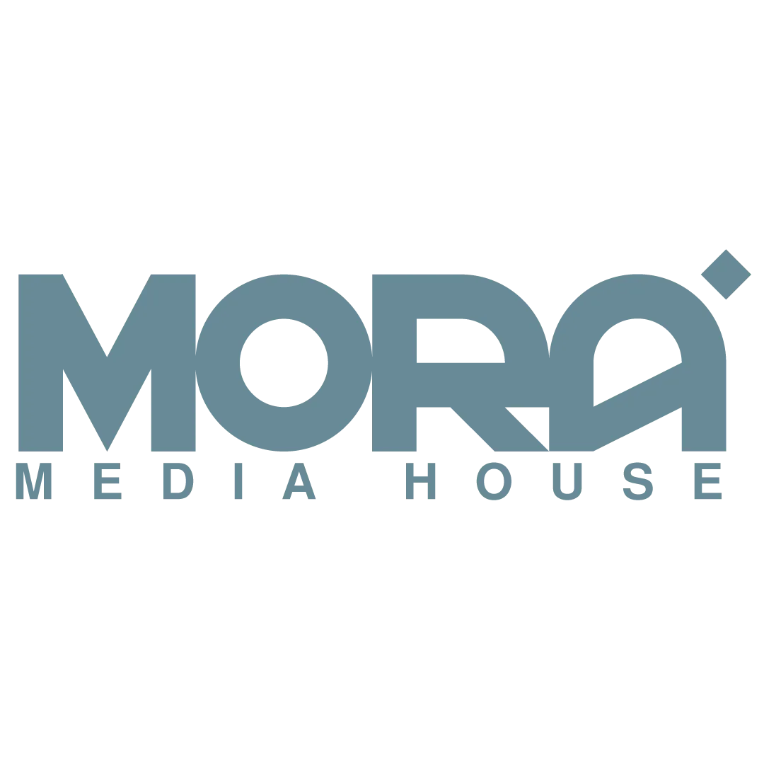
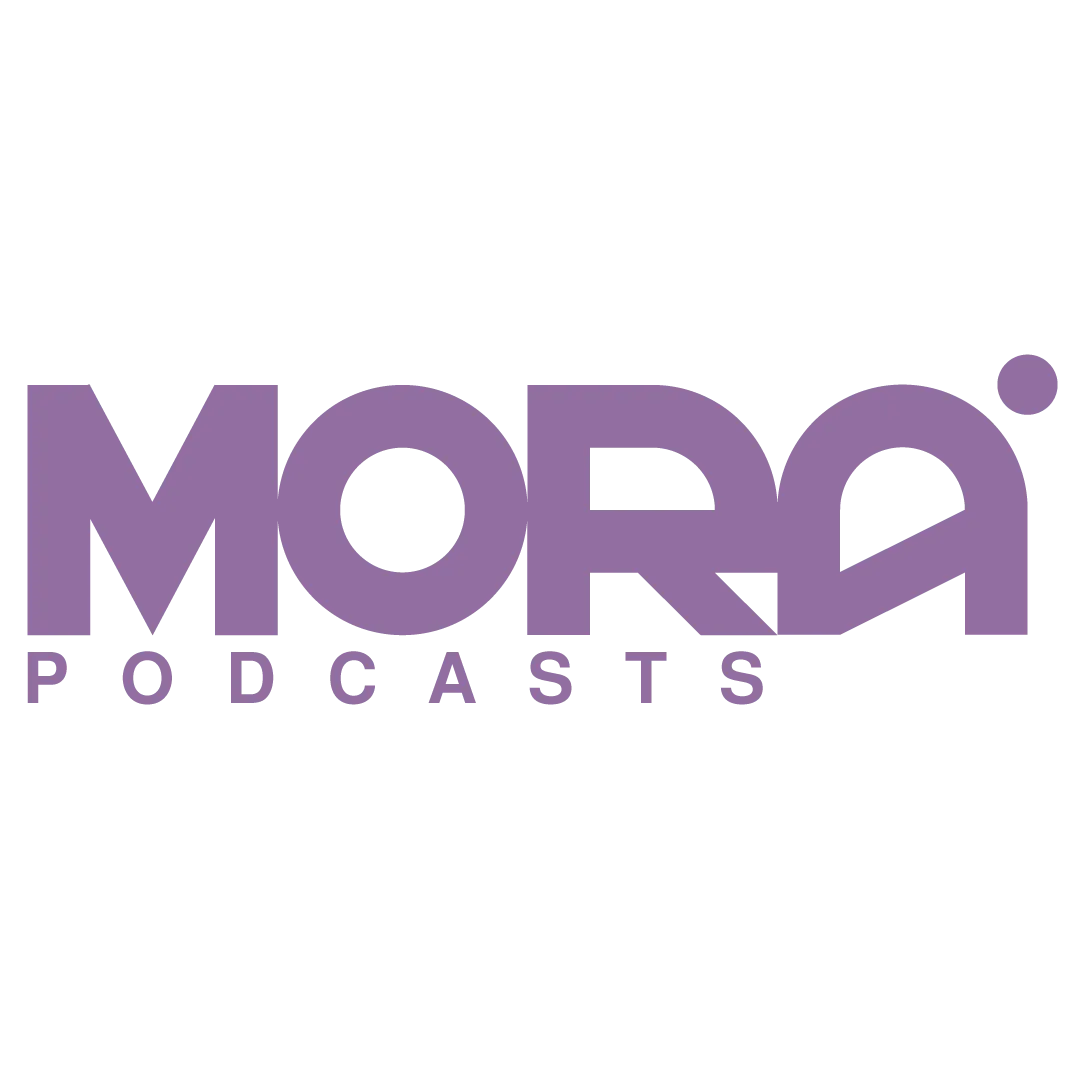
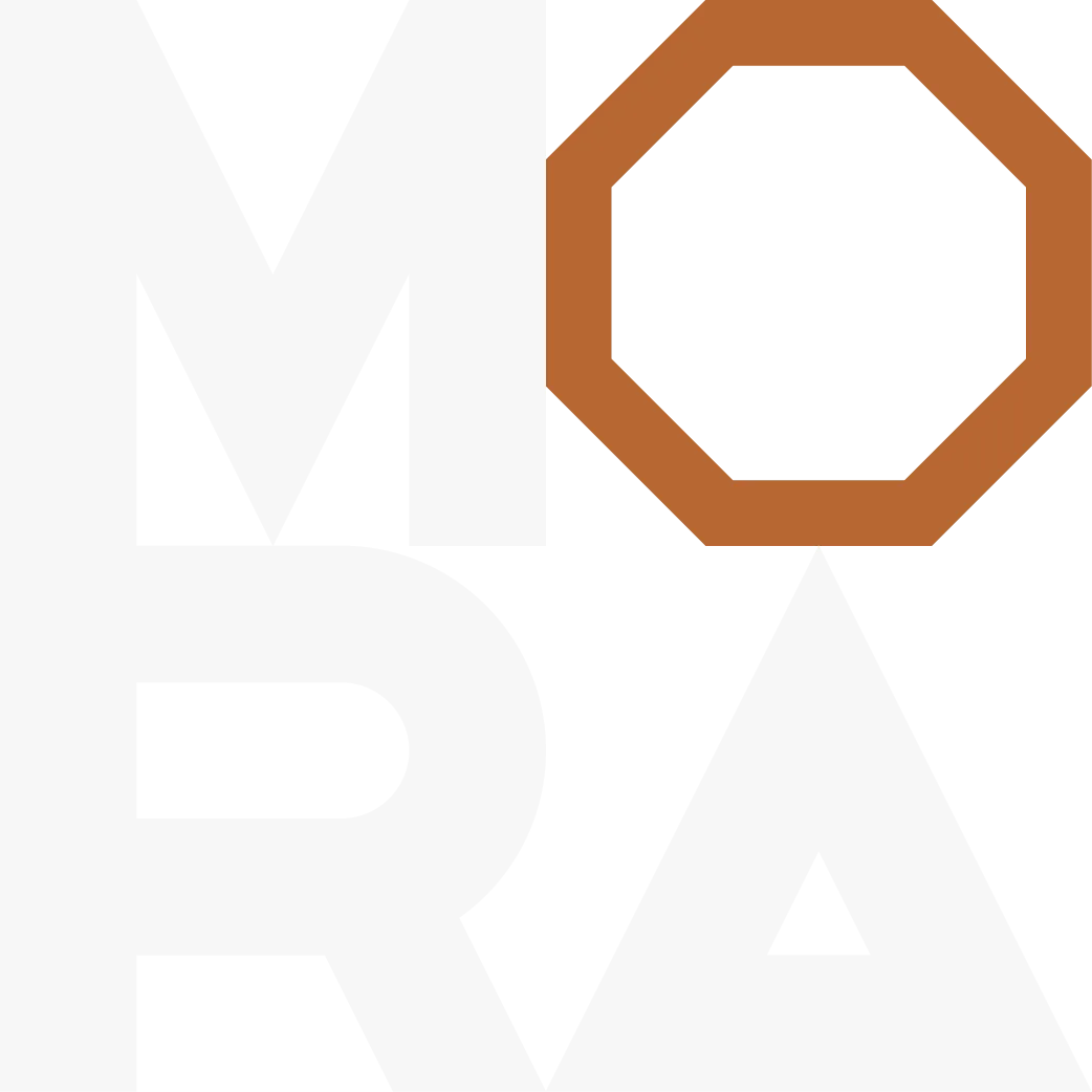
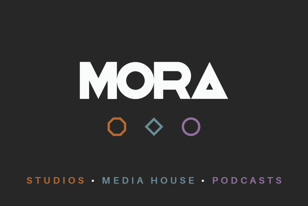
The solution centres on a geometric, shape-led logo system; an octagon for Mora Studios evoking photographic light, a diamond for Mora Media House referencing video keyframes, and a circle for Mora Podcasts symbolising conversation and community.
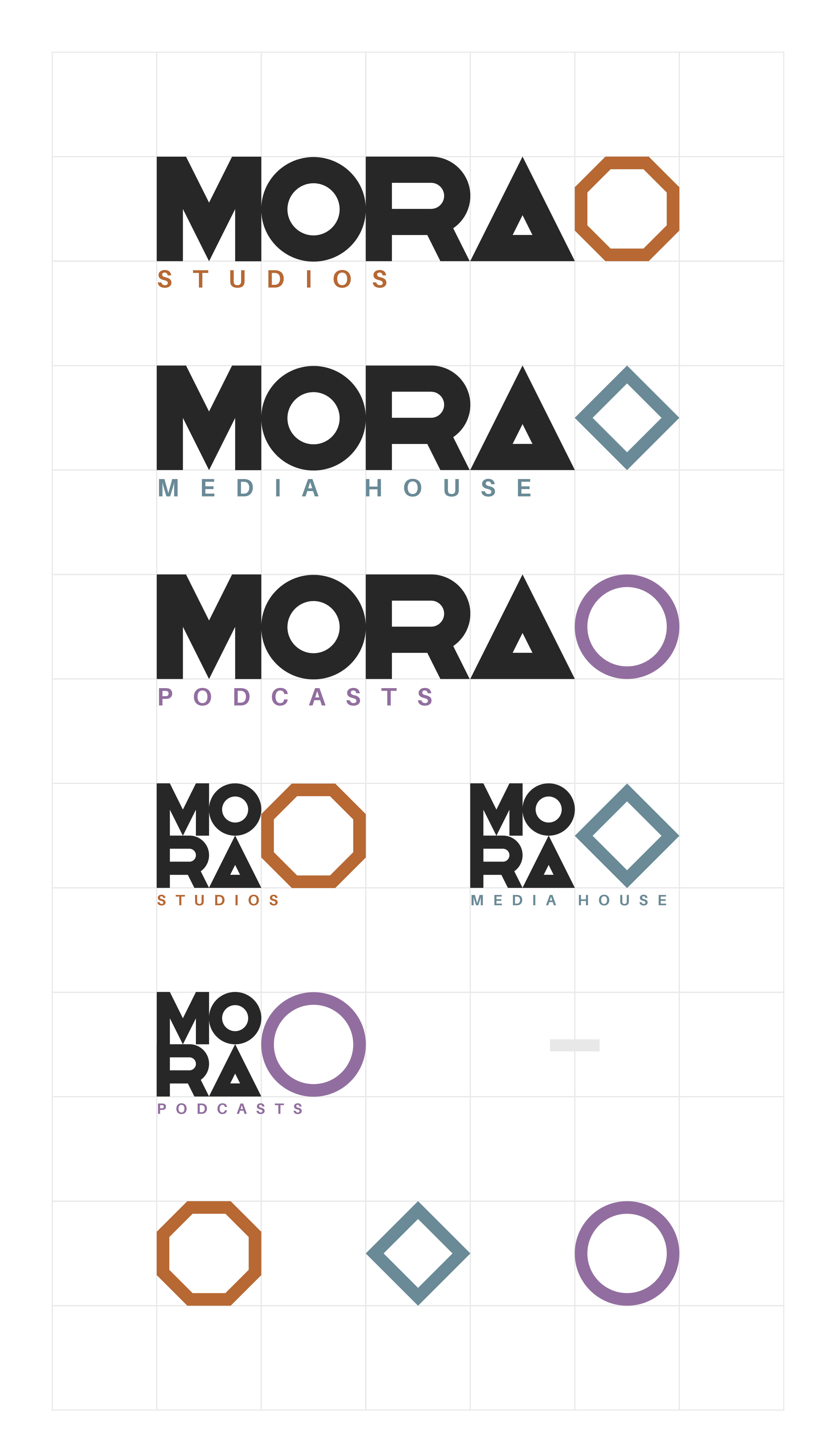
Each letterform conforms to a square grid, allowing a single aperture to sit cleanly within the stacked wordmark, which doubles as a dynamic window for framing content. A high-contrast black-and-white palette unifies the identity, with distinct accent colours differentiating each sub-brand. The result is a modular, scalable visual language that holds the three ventures together while preserving individual character.


“Will hit the nail on the head straight away. He understood exactly what I was after and delivered an amazing, versatile end result. Thanks again!”
James Edgecombe // MORA
▼
Start Your Project
Got a project to start? Click Get Started below.
Terms & Conditions
WillMWCreative Design Manfesto
Frequently Asked Questions